Build Early Money Habits

In this assignment I was tasked with defining the UI Style Guide and developing key platform features for the primary sales page and student onboarding experience for the Build Early Money Habits platform.
Build Early Money Habits, is a financial educational platform geared towards children ages 10-12 to help build understanding around money, with the goal of helping kids learn how to manage personal finances as they age into adulthood.
Timeline
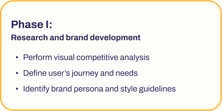
To accomplish the goal of developing the UI Style Guide and primary platform features, I broke this project into 2, 1-week, phases.


Research
Diving into the development of the Build Early Money Habits platform, I started off by performing visual competitive research to discover potential opportunities for marketplace advantages.
In my research I learned that primary user’s could use:
A more streamlined single all-encompassing sales page
Information presented in brief, to-the-point sections
Prudent information displayed through data visualization
And a harmonious and accessible color scheme along with age appropriate visuals
Wireframing + Lo-Fi Prototypes
After defining key essential user needs, I did rounds of rapid wireframing to define page layouts, establish platform features and determine ideal user task flows.
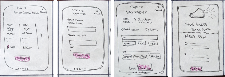
Sign up task flow

Student onboarding task flow
To refine these visuals and features further, I selected the most ideal wireframe mock ups to develop into Low-Fidelity layouts and asked my fellow cohort members to review for an initial round of testing and feedback.

Singular Sales Page (highlighting 3 sections: Hero Welcome section, the Course Overview section, and the Reserve Your Seat/Sign Up section.

Student Onboarding Flow: Create an Account screen, Select an Avatar screen, and the top section of the Classroom Dashboard page
Developing the UI Style Guide
From research findings and rounds of testing I worked to establish the Build Early Money Habits style guide.

The platform’s tone and voice and persona should reflect the ideal middle-school teacher: someone who is charismatic yet knowledgeable; someone parents respect and to whose classroom students flock to because learning is made fun and accessible.
A deep dark purple palette paired with warm yellow tones was developed to exhibit a premium, accessible and exciting learning experience.
A thin round iconography collection was selected to help symbolize childhood.
The Chivo font-family was selected due to its clean san-serif styling with a slight nod to a more playful childlike design.
A collection of bright and cheery illustrative middle-school aged characters, will be used to lead students through interactive learning materials. Additional characters will be developed to reflect cultures and identities that students will be able to connect with both visually and emotionally.
User Testing
As I wrapped up research, defining the user journey and developing the platform style guide to help guide the user experience, I moved to testing Mid- and then High Fidelity prototypes to refine visuals and feature functionality and refine the UI style guide even further.
Mid-Fidelity Testing Findings
Adjusted key functionalities
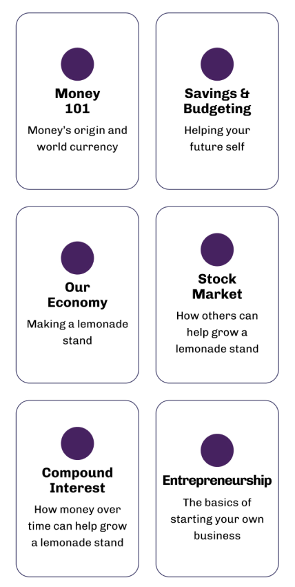
Testing revealed that rather than presenting course information in a horizontal scroll pattern, like originally planned, this information would best be presented in a 2-column vertical layout to provide clarity and distinguish from other interactive elements.
Ease user’s cognitive modes
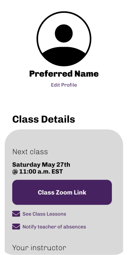
It was also discovered that providing greater visibility to class lessons on the Classroom Dashboard the means of a link at the top of the screen, would ease the user’s journey and increase their ability to discover information without having to scroll.
High-Fidelity Testing Findings
Provide multiple means of navigation
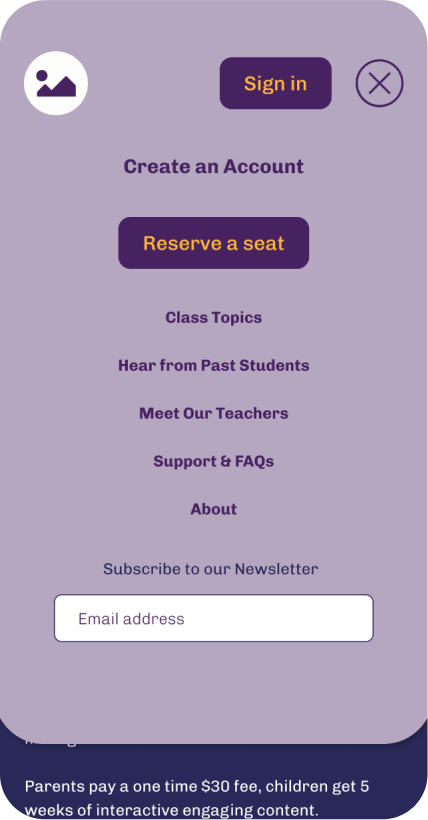
Testing showed that users needed an additional way to Create an Account apart from the originally provided options through the Sign In screen and at the end of the Sign Up process, as such, an additional option to perform this task was added to the expandable menu.
Micro-interactions to encourage scrolling
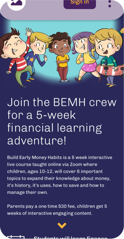
Testing showed that users needed a visual cue to help encourage scrolling through the home page, as such I implemented a micro-interactive arrow that will animate and encourage users to scroll as they hover with their mouse or swipe with their fingers.
Better visual hierarchy for prudent information
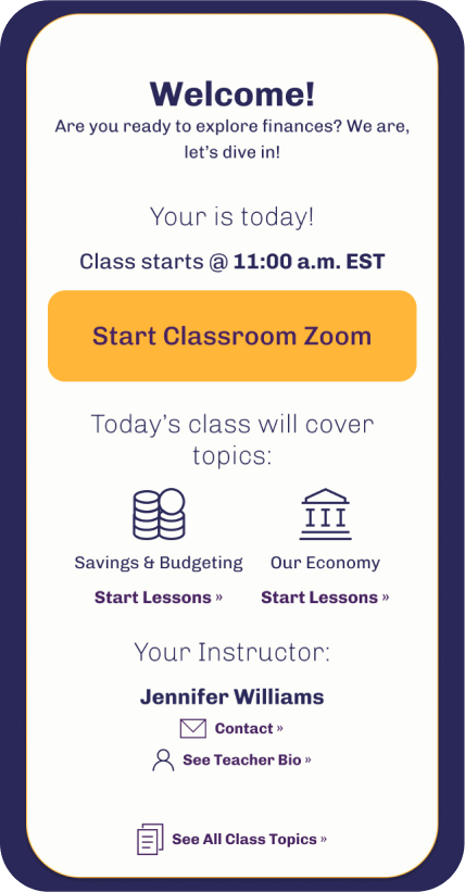
Further testing uncovered that the user’s journey once on the Classroom Dashboard needed to be eased even further and the Student Class Details section needed to be restructured further to provide greater accessibility to class information.
Finalizing Initial Platform Screens
Through the finalizing of the UI style guide and rounds of testing Mid and High Fidelity prototypes… The mobile screens and pages for the Build Early Money Habits platform have been finalized.
Next Steps
With the Style Guide and primary mobile screens established next steps will include expanding the development of the Build Early Money Habits platform by:
Building out the tablet and desktop views
And developing supporting internal pages

Project Takeaways
Having established the user needs, task flows, and prioritizing features early on really helped provide focus points for what visuals and features would be ideal for both the client and users.

Having research findings to back up decisions made would strengthen the user experience and ensure that the primary user’s needs and pain points are met.


